tend / brand campaign

Director, Art. Concept ideation, photo and video direction, production.

Tend was created to help people look forward to the dentist by designing a member-first experience from online booking, to their soothing spaces. To help gain awareness of the brand in new markets, we ideated and executed the first out-of-home campaign.

scroll ↓

The campaign concept came from the initial insight that people would rather do almost ANYTHING else than go to the dentist. Using first-person “confessions”, we surfaced all the painful, absurd, dreadful, amusing things people would rather do, and paired them with all the amazing ways Tend does it differently.


New York City Subway
We took our video concept and brought our confessions to life in print using bold typography, our Tend green color palette and localized copy for each city to make it extra relatable.


Washington D.C. Bike Share & Boston Bus Shelters
In every execution, we designed “I’d rather go the dentist” to stand out. Each copy line is paid off by strategically showcasing the top reasons people come to tend: insurance, online booking, beautiful spaces, convenient locations, and appointment times.


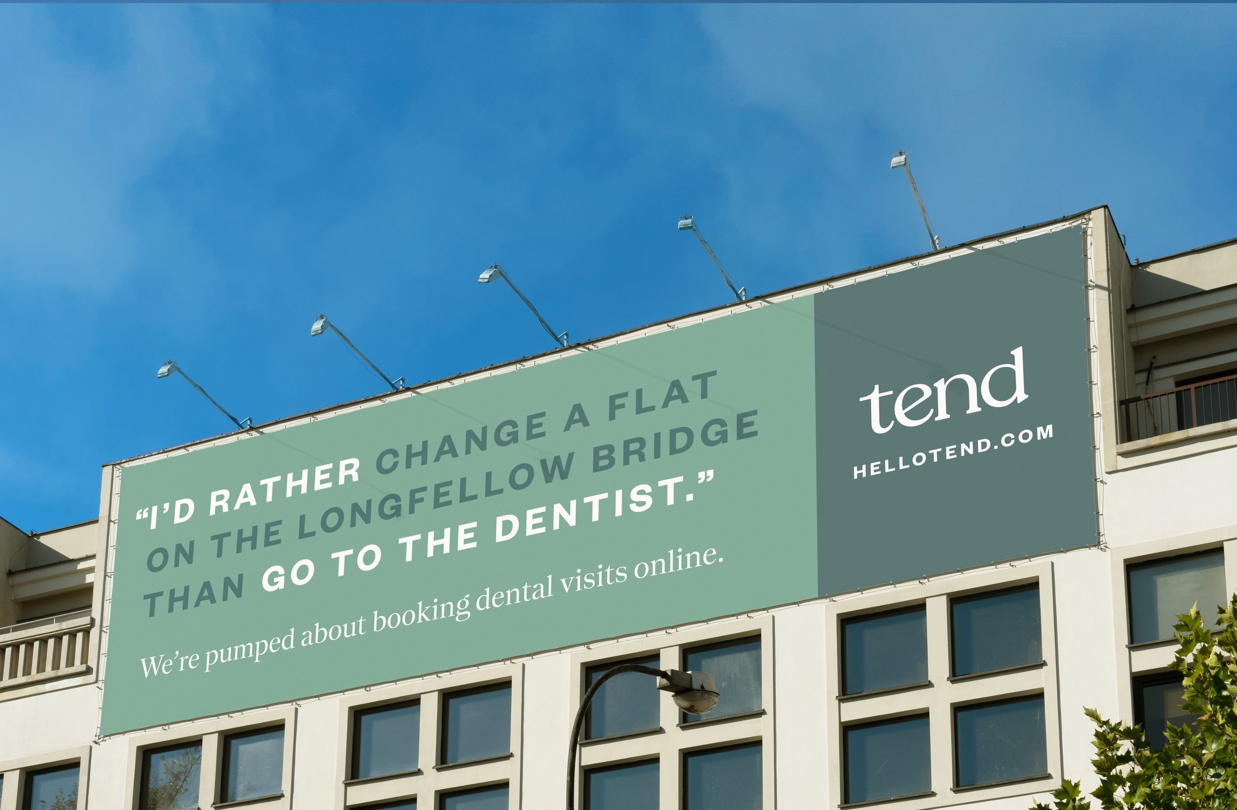
Boston Billboard
We created unique copy for our largest ad, located next to the Longfellow Bridge, to catch people’s attention while driving.


Social Media
No campaign is complete without bringing a concept to life through social media


Previous
Previous

tend (hellotend.com)

Next
Next

w magazine typography